Minimalism vs. Maximalism: Fresh brand design in developer tools
Finally, the corporate look is in recession
I’ve noticed a very cool shift in branding strategies particularly in developer tools with two distinct approaches emerging: extreme minimalism 🏢 and whimsical maximalism 💫.
Minimalism emphasizes clean, straightforward interfaces that convey “no fluff, only value.” On the flip side, maximalism is all about bringing personality and a sense of fun—because let’s face it, we’re all a little tired of being so serious.
Trend Alert: Minimalism
Minimalist brands focus on simplicity, creating distraction-free environments that highlight functionality and utility. Here are a few that I think are doing it well.
Zed’s design is simplicity - almost reminds me of an architectural blueprint.
Fiberplane offers a minimal, modern aesthetic.
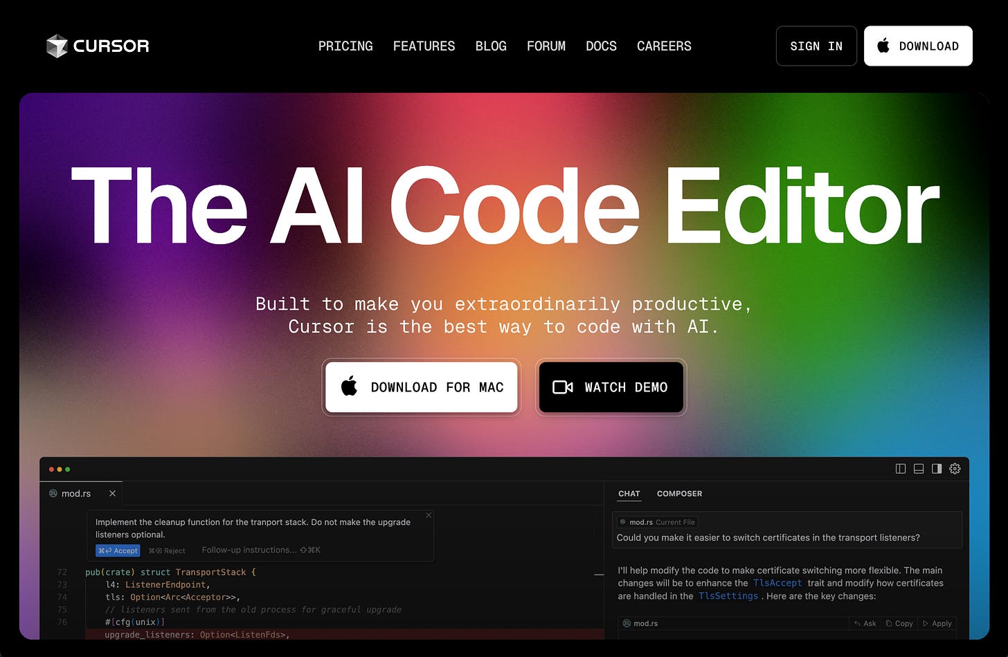
Cursor’s clean UI with a little color flare.
Trend Alert: Maximalism
Maximalist brands, on the other hand, are bringing fun back into the mix with bold designs and engaging elements that make their tools stand out. Here are a few favorites:
PostHog why not have maximum fun with brand especially if you’re working with the overlap of developers and marketers.
Sentry adds play and personality
Retool has a retro modern feel with mixed media graphics
StarbaseDB goes old school fun
Design should take risks this year
Developer tools have the opportunity to push boundaries with their brand and in response to designs having merged into one corporate look the last few years, I’m excited for both modern minimalism or hyper maximalism this year.


